This session explains the way to customize all layout and theme, as the logo, color, font, left menu side, setting screen (page view, web view), dark theme, onboarding screen, login mode... If there is any isssue with the installing, please share the screenshot of the issues and post to support ticket - https://support.inspireui.com.
1. Video Guide
Customize the design of your FluxNews app via FluxBuilder
How to hide/disable/turn off any UI from App?
The solution to answer the questions like "how to change my homepage icons, Hamberger menu icon", "how to disable/hide any UI from the app?", "how to disable options from settings sections , like language, currency, dark theme", is using the Inspector Tools from Android Studio to customize any UI from the app.
Video guide:
Manual guide: Please refer to this document for the detailed guidline:
Example, how to change the Icon from homescreen below (Hamberger menu icon):

Click the icon from Android Studio to enable Inspector Mode, then click to the UI Icon, the Android Studio will be jump to the widget that is ready to change new value

2. Update the Horizontal Homepage Layout
Open lib/common/config_xx.json and use of these config for the layout. Where xx is your language, i.g. config_en.json is English, config_ar.json is Arabic. With multi languages feature, the /lib/common folder will have these files: config_ar.json, config_en.json, config_vi.json, ... If you want to add a new language, you copy the configuration to other config_xx.json files so that you can see the changes reflected when changing language.
Note: If your images are not loaded, it seems like this issue comes from the lack of several necessary plugins in your site. Please make sure that
Better REST API Featured ImagesandRegenerate Thumbnailslatest version are installed and enabled. Don't forget to run "Regenerate Thumbnails for Attachments" to make sure all of your set up are correct. Also refer to "4. Install Required plugins"
Banner Slider Image

🗳 Coding Guide: widget file path: lib/widgets/blog/banner/banner_slider_items.dart
📖 Usage: config lib/common/config_en.json as following option to enable the slider image.
layout: bannerImageisSlider: trueshow the banner as slideritems: is the array of json image object, each image can be link to list of products by category ID
	{
      "layout": "bannerImage",
      "isSlider": true,
      "design": "default",
      "showBackGround": true,
      "radius": 2.0,

      "items": [
        {

          "category": 40,
          "image": "https://images.unsplash.com/photo-1448131063153-f1e240f98a72?ixlib=rb-1.2.1&ixid=eyJhcHBfaWQiOjEyMDd9&auto=format&fit=crop&w=500&q=60",
          "padding": 15.0

        },
        {
          "category": 41,
          "image": "https://images.unsplash.com/photo-1496318447583-f524534e9ce1?ixlib=rb-1.2.1&ixid=eyJhcHBfaWQiOjEyMDd9&auto=format&fit=crop&w=500&q=60",
          "padding": 15.0
        },
        {
          "category": 31,
          "image": "https://images.unsplash.com/photo-1558920558-fb0345e52561?ixlib=rb-1.2.1&ixid=eyJhcHBfaWQiOjEyMDd9&auto=format&fit=crop&w=500&q=60",
          "padding": 15.0
        }
      ]
    },
Blog List Views
Support following layout styles:
| Four columns |

|
|---|---|
| Three Columns |

|
| Two Columns |

|
| Card View |

|
🗳 Coding Guide: widget file path: lib/widgets/blog/blog_list.dart and lib/widgets/blog/blog_card_view.dart
📖 Usage: Support to show list of Products by flexible layout (Card, two column or three columns) by adding this section to the lib/common/config_en.json
name: the name to display the card titlelayout: the support layout should befourColumn,threeColumns,twoColumns,cardcategory: the category id of your website.
{
      "name": {
        "en": "Four Column Default",
        "ab": "Four Column Default",
        "vi": "Four Column Default"
      },
      "image": "",
      "layout": "fourColumn",
      "category" : 36
    },
Horizon Slider List

🗳 Coding Guide: widget file path: lib/widgets/blog/horizontal/slider_list.dart
📖 Usage: config lib/common/config_en.json as following option:
layout:sliderBlogListtype: support detail with image on the left andimageOnTheRight-
category: the category id of the Blogs{ "layout" : "sliderBlogList", "type": "imageOnTheRight", "imageBorder": 3.0, "name": { "en": "Slider Horizontal Blog List", "ab": "Slider Horizontal Blog List", "vi": "Slider Horizontal Blog List" }, "category": 33 },
Horizon Large Card

🗳 Coding Guide: widget file path: lib/widgets/blog/horizontal/horizontal_list_items.dart
📖 Usage: config lib/common/config_en.json as following option:
layout:largeCardHorizontalListItemsimageBorder: the border radius of the card-
category: the category id of the Blogs{ { "name": { "en": "Large Card Layout", "ab": "Large Card Layout", "vi": "Large Card Layout" }, "layout" : "largeCardHorizontalListItems", "imageBorder": 20.0, "category": 41 }, },
Staggered List

🗳 Coding Guide: widget file path: lib/widgets/blog/blog_staggered.dart
📖 Usage: config lib/common/config_en.json as following option:
layout:staggered-
category: the category id of the Blogs{ "name": { "en": "Staggered Default", "ab": "Staggered Default", "vi": "Staggered Default" }, "layout": "staggered", "category": 33 },3. Change the logo and Icons, splash screen
Open lib/common/constants.dart to map your news image Logo and icon file.
const kLogoImage = 'assets/images/logo.png';
const kSplashScreen = "assets/images/splashscreen.png";
4. Change the App Color
Open lib/common/config_en.json file in project.
You could change most of components color in Color section.
For example, you could change the color of Tabbar to any color you like, then reload the app to see the effect.
"Setting": {
  "MainColor": "#3FC1BE",
  "ProductListLayout": "list"
}
🗳 Coding Guide: to customize the
themefolder to thecommon/styles.dart5. Change the default Font and Header Font
Open pubspec.yaml and replace with your new font file that already copied to the asset folder:
  fonts:
    - family: Raleway
      fonts:
        - asset: assets/fonts/Raleway-Regular.ttf
        - asset: assets/fonts/Raleway-Medium.ttf
        - asset: assets/fonts/Raleway-Bold.ttf
        - asset: assets/fonts/Raleway-Light.ttf
        - asset: assets/fonts/Raleway-Thin.ttf
    - family: Roboto
      fonts:
        - asset: assets/fonts/Roboto-Regular.ttf
        - asset: assets/fonts/Roboto-Medium.ttf
        - asset: assets/fonts/Roboto-Bold.ttf
        - asset: assets/fonts/Roboto-Light.ttf
        - asset: assets/fonts/Roboto-Thin.ttf
🗳 Coding Guide: go the lib/common/styles.dart and change to new fontFamily. Make sure the spacing the align correctly
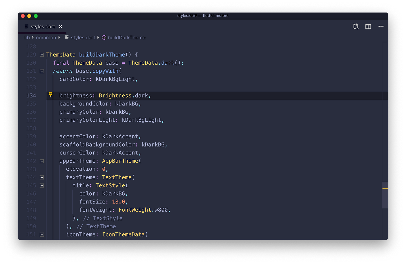
6. Dart theme Setting
New release also supports Dark theme setting, thanks to Flutter bring the best theming built in. To change the background or customize your own colors, just simply open the lib/common/styles.dart and change buildLightTheme or buildDarkTheme functions.
To config the default theme is Dark theme: Navigate to lib/models/app.dart then change this value from false to true:
class AppModel with ChangeNotifier {
...
bool darkTheme = false;
...
}
7. Drawer (left menu side)

New Left menu side is now easier to navigate between the Shop and other menu items. The menu could be opened by swiping from left to right or trigger by this function Scafford.of(context).openDrawer()
To add new menu item go to lib/tabbar.dart
        drawer: Drawer(child: MenuBar()),
        bottomNavigationBar: SafeArea(
          top: false,
          child: Container(
            width: screenSize.width,
            child: FittedBox(
              child: Container(
                width: screenSize.width /
                    (2 / (screenSize.height / screenSize.width)),
                child: TabBar(
                  controller: tabController,
                  tabs: renderTabbar(),
                  isScrollable: false,
                  labelColor: Theme.of(context).primaryColor,
                  indicatorSize: TabBarIndicatorSize.label,
                  indicatorPadding: EdgeInsets.all(4.0),
                  indicatorColor: Theme.of(context).primaryColor,
                ),
              ),
            ),
          ),
        ),
8. Onboarding screens and strict Login mode.
To customize the onboarding content (welcome screen), edit the file lib/common/config.dart
List onBoardingData = [
  {
    "title": "Welcome to FluxNews",
    "image": "assets/images/fogg-delivery-1.png",
    "desc": "FluxNews is on the way to serve you. "
  },
  {
    "title": "Connect Surrounding World",
    "image": "assets/images/fogg-uploading-1.png",
    "desc": "See all things happening around you just by a click in your phone. "
        "Fast, convenient and clean."
  },
  {
    "title": "Let's Get Started",
    "image": "fogg-order-completed.png",
    "desc": "Waiting no more, let's see what we get!"
  },
];
There is also a new feature to require strict user login before using the app by enabling IsRequiredLogin
const kAdvanceConfig = {
...
"IsRequiredLogin": true,
...
};
9. Page View (Settings screen)
Page view is used to display a static page faster than using WebView. For those who want to customize a page view, at this moment, please follow instructions below for hard-coding this feature. We will update this feature in config.dart in the near future.

In order to add PageScreen in your left-side menu, please open /lib/menu.dart. Inside the column under the logo image, add the following ListTile .
ListTile(
                  leading: const Icon(
                    Icons.pageview,
                    size: 20,
                  ), // Replace your Icon for PageScreen here
                  title: Text(S.of(context).pageView),
                  onTap: () {
                    Navigator.push(
                      context,
                      MaterialPageRoute(
                        builder: (context) => PostScreen(
                          pageId: 743, // Replace your pageID here
                          pageTitle: S.of(context).pageView.toString(), // Replace your place title here
                        ),
                      ),
                    );
                  },
                ),
Or you can also add PageScreen widget into your SettingPage by adding following code. Open /lib/screens/settings.dart, inside SliverChildListDelegate, add the below code in your desired position:

                    Card(
                        margin: EdgeInsets.only(bottom: 2.0),
                        elevation: 0,
                        child: ListTile(
                          leading: const Icon(
                            Icons.pageview,
                            size: 20,
                          ), // Replace your PageScreen icon here
                          title: Text(
                            '${S.of(context).pageView.toString()}', // Replace your page title here
                            style: TextStyle(fontSize: 15),
                          ),
                          trailing:
                              Row(mainAxisSize: MainAxisSize.min, children: [
                            SizedBox(width: 5),
                            Icon(Icons.arrow_forward_ios,
                                size: 18, color: kGrey600),
                          ]),
                          onTap: () {
                            Navigator.push(
                              context,
                              MaterialPageRoute(
                                builder: (context) => PostScreen(
                                  pageId: 743, //Replace your page ID here
                                  pageTitle: S.of(context).pageView.toString(), // Replace your page title here
                                ),
                              ),
                            );
                          },
                        ),
                      ),
In which:
leadingcould be any icon depending on your interest.- Inside
PostScreenwidget,pageIdparameter is the ID of your desired page andpageTitleis the app bar title. Please adjust to meet your need.
10. Web View (Settings screen)
In spite of the fact that a WebView widget takes more time to load compared to a PageView, WebView sometimes could be taken into consideration due to its flexibility and adaptability. In order to add a WebView inside your app, please take a look at those code (adding a WebView into left-side menu) for reference and make some modifications if needed to meet your need.


In order to add WebView in your left-side menu, please open lib/menu.dart. Inside the column under the logo image, add the following ListTile .
import 'widgets/webview.dart';

  return ListTile(
            leading: const Icon(
              Icons.web,
              size: 20,
            ),
            title: Text(S.of(context).webView),
            onTap: () {
              Navigator.push(
                context,
                MaterialPageRoute(
                  builder: (context) => WebView(
                    url: "https://inspireui.com", //replace your url here
                    title: S.of(context).webView, //replace your title here
                  ),
                ),
              );
            },
          );
In which:
leadingcould be any icon depending on your interest.- Inside
WebViewwidget, kindly adjust "url" and "title" parameter with your data to display your desired web.
11. The loading animation between screens
To change the loading animation (Loading indicator gif) between screens, open the lib/common/constants.dart file and change the below value:
Widget kLoadingWidget(context) => Center(
    child: SpinKitFadingCube(
      color: Theme.of(context).primaryColor,
      size: 30.0,
    ),
  );
12. Detail blog layouts
Currently, FluxNews could be able to support 3 different types of detailed blog layout, including: One Quarter Size Image, Half Size Image and Full Size Image. In order to configurate those settings, please go to:
const kAdvanceConfig = {
...
"DetailedBlogLayout": "enter-detailed-blog-layout-here",
...
}
in which detailed blog layout values could be halfSizeImageType, fullSizeImageType or oneQuarterSizeImageType. Three attached images below represent for 3 different layout values mentioned above, respectively.
halfSizeImageType |

|
|---|---|
fullSizeImageType |

|
oneQuarterSizeImageType |

|
Besides, FluxNews is able to automatically detect video url from Vimeo, Facebook and Youtube in post content and display it in oneQuarterSizeImageType.
